r/F1Technical • • Apr 01 '26

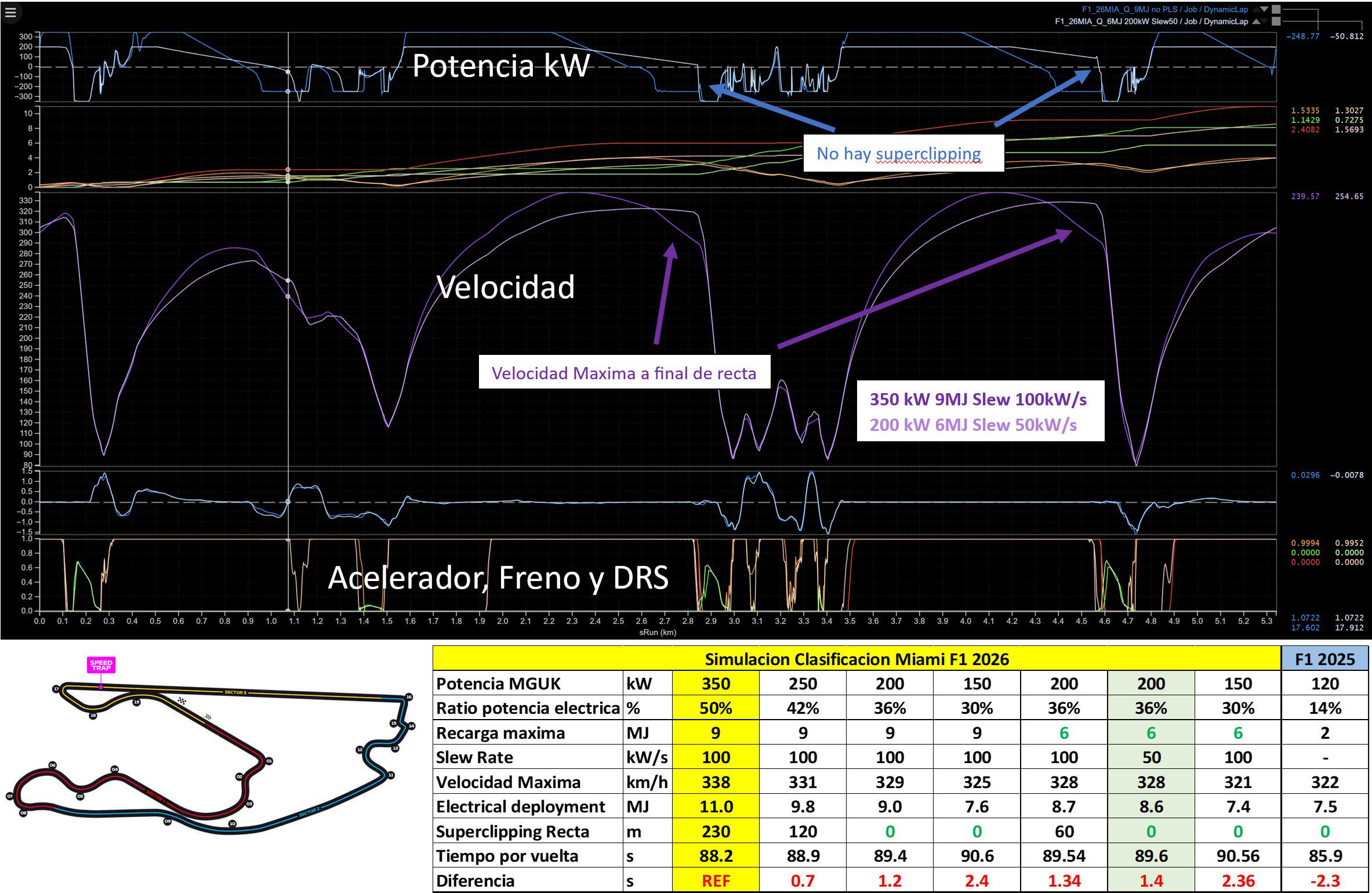
Analysis A simulation by former F1 engineer Toni Cuquerella (@tonicuque on X) shows that a decrease in MGU-K power from 350kW to 200kW, and Recharge limit reduction from 9MJ to 6MJ will completely eliminate superclipping in Miami

Post image
1.3k Upvotes

r/F1Technical • • Feb 26 '26

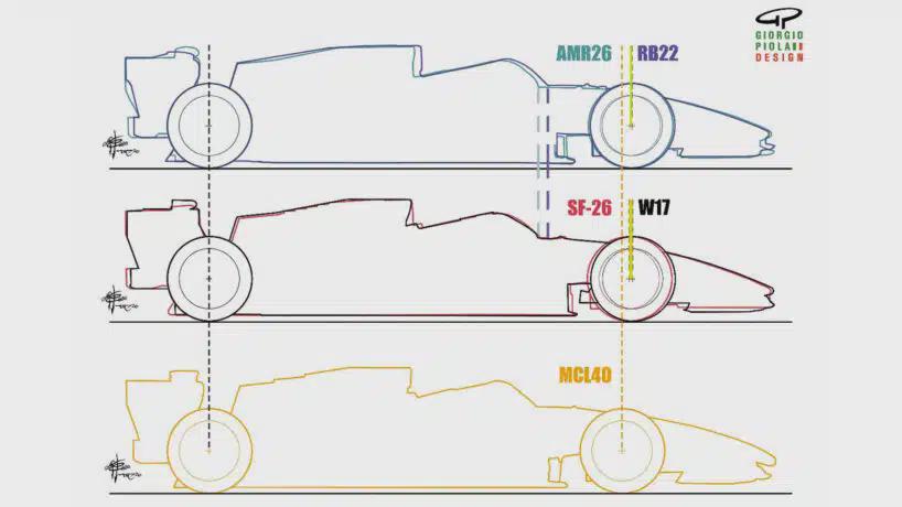
Analysis McLaren has a whole 100mm shorter wheelbase than other cars

Post image
1.9k Upvotes

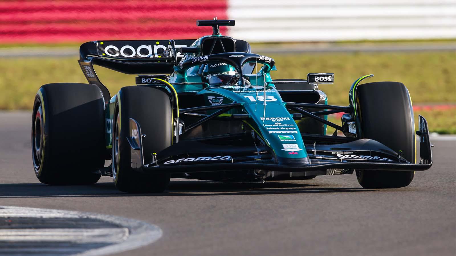
"careful analysis of images — and subsequent confirmation from within the team — reveals that the McLaren is around 10cm shorter than the full wheelbase cars of Mercedes, Ferrari, Red Bull and Aston Martin"

r/F1Technical • • Mar 21 '25

Analysis Hamilton could’ve pulled off a 1:30:5 at China

Thumbnail
gallery
4.9k Upvotes

Hey Everyone. I was watching the Ghost car lap comparison and noticed how Max closed the Gap by a lot in the last two sectors. Sorry for the “Learnt something new stuff” in the end. It’s my Instagram post, so just wanted to share it here too.

r/F1Technical • • Jul 28 '25

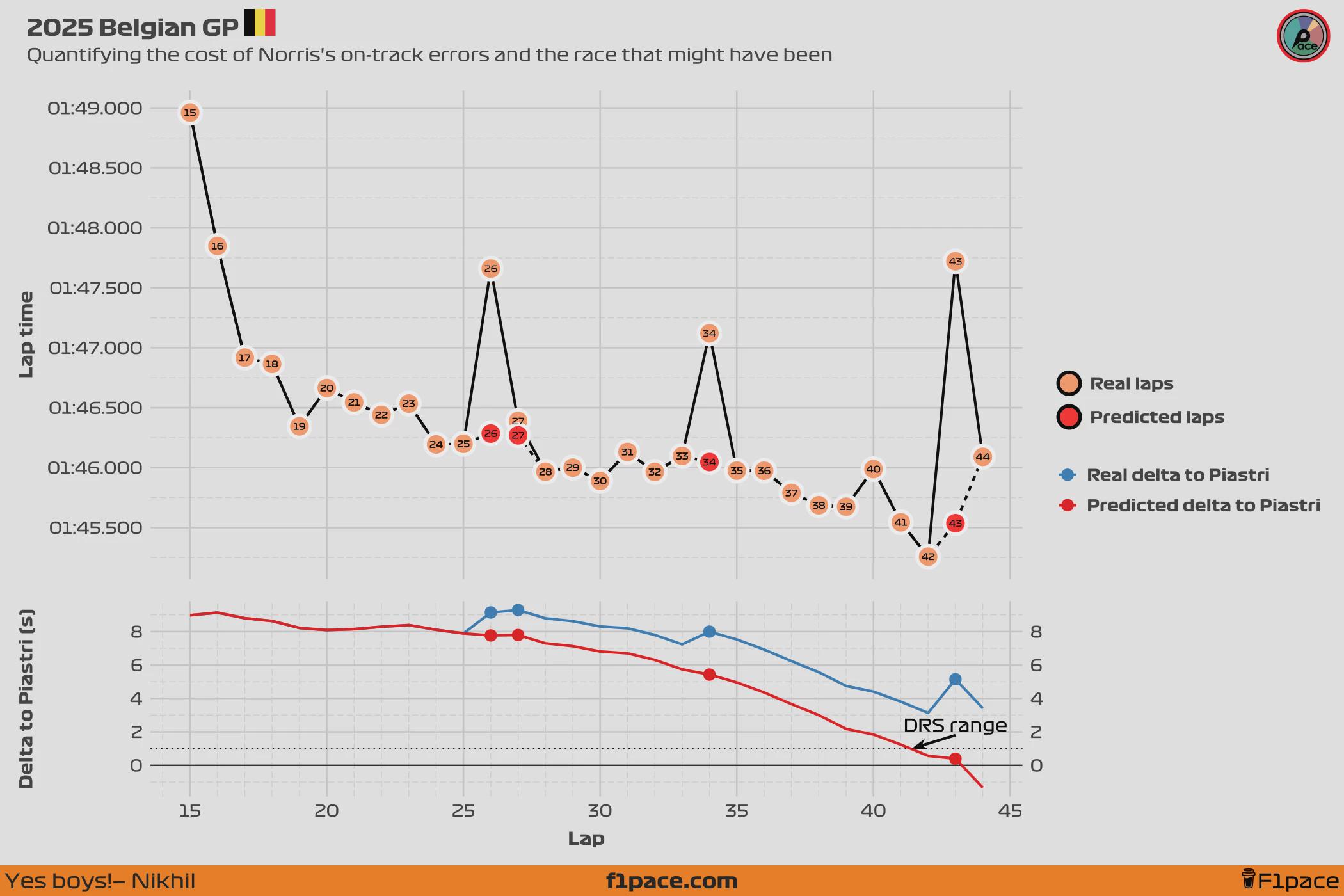
Analysis 2025 Belgian GP: Quantifying the cost of Norris's Mistakes

Post image
2.1k Upvotes

Hello everyone. I just finished a post about Norris and the situation he found himself in during the 2025 Belgian GP. I wanted to see what would've been the scenario if Norris had not made the 3 costly mistakes he made on laps 26, 34 and 43. Could have he caught up Piastri? While we can’t say for certain what would have happened if Norris had avoided these errors, we can model a simulated scenario in which his laps were clean.

The main limitation of our analysis is that our model can’t predict how Norris’s presence might have influenced Piastri’s performance, or whether Piastri had any extra pace in reserve. Assuming Piastri was already driving at his limit, there’s a strong chance Norris could have been close enough to challenge for the lead in the final 2–3 laps of the race.

I'm leaving the link to the full article here in case you want to check it out. You can check the detailed model predictions in a table at the end of the article, as well as the detailed predicted delta from laps 15 to 44 of the race.

Have a great day everyone, take care.

r/F1Technical • • Jul 09 '22

Analysis Animated comparison between Verstappen and Charles Qualy Lap (AutoSport)

6.8k Upvotes

r/F1Technical • • Mar 16 '25

Analysis What happened to Bortoleto's rear assembly while he spun today?

Post image
1.3k Upvotes

r/F1Technical • • Feb 15 '23

Analysis Mercedes and Ferrari have fundamentally different philosophies for cooling and airflow. I love the possible different approaches in the regulations!

Post image
2.9k Upvotes

r/F1Technical • • Mar 15 '26

Analysis The battery percentage graphic is actually pretty accurate

Thumbnail gallery
806 Upvotes

r/F1Technical • • Feb 25 '25

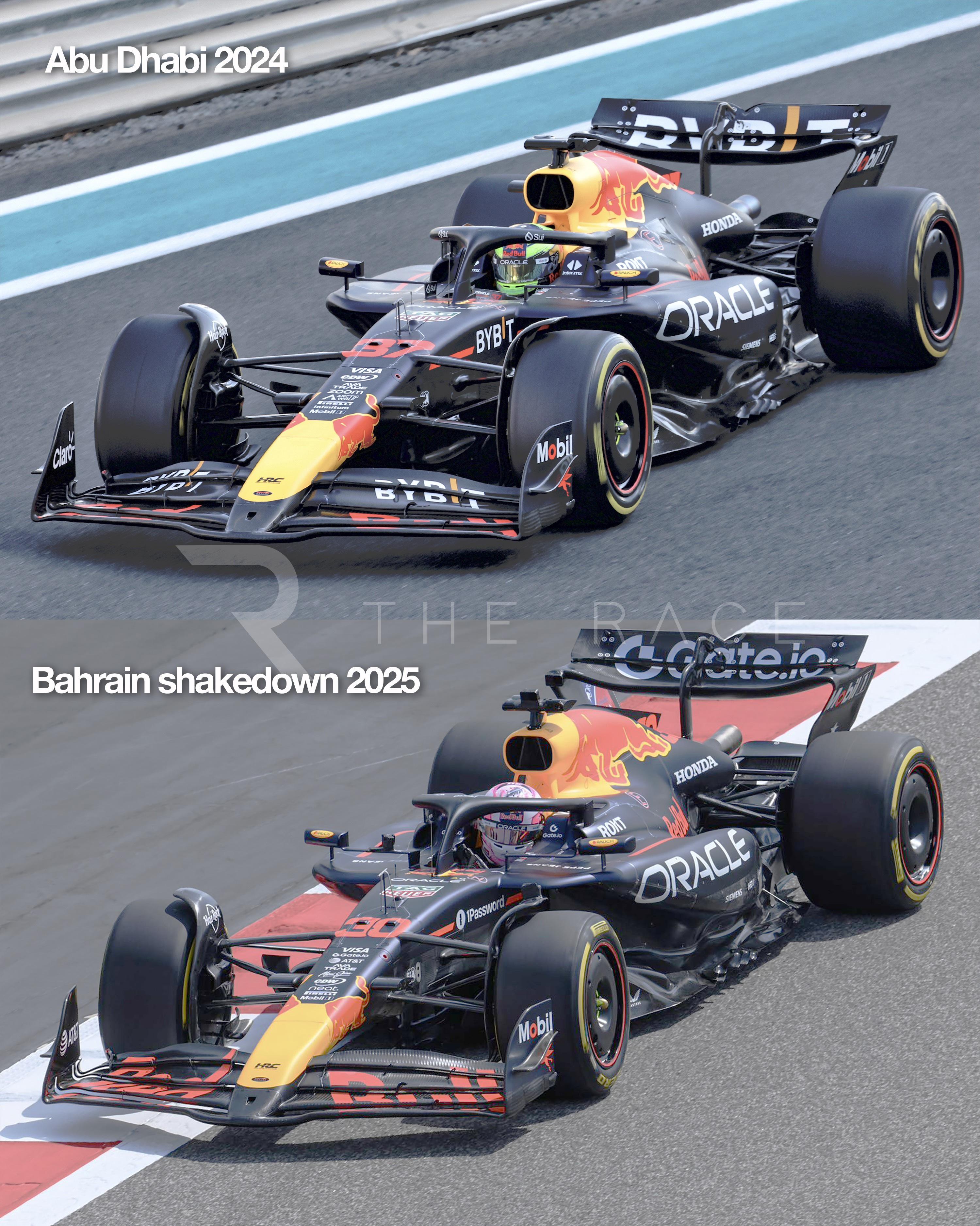
Analysis Are Red Bull making history? Has there ever been less difference between preceeding and succeeding F1 car models?

Post image
756 Upvotes

r/F1Technical • • Apr 02 '25

Analysis I made a really cool website to visualize the raw telemetry data from F1 races!

Thumbnail
gallery
1.1k Upvotes

Hey guys,

As a fellow motorsport tech enthusiast, I built Fastlytics to dive deeper into the technical side of F1 using telemetry data. I made this tool bridge the gap between raw data and actionable insights, and I’d love feedback from this community!

What it does:
- Speed Traces: Compare corner/straight speeds between drivers (e.g., why a driver gained time in Sector 2).
- Position Tracking: Animated lap-by-lap position changes.
- Tire Strategy Analysis: Visualize stint lengths, compound degradation, and pit-stop impacts.
- Gear/Throttle Maps: See gear usage and throttle application across track sections.

Tech Stack (For the Engineers Here):
- Data Source: FastF1 Python library (timing data, telemetry, weather).
- Frontend: React + TypeScript - Backend: Python API for data processing (lap segmentation, telemetry alignment) and FastAPI

Check it out here: Fastlytics
GitHub Repo: Link (MIT Licensed – PRs welcome!)

Questions for the Community:
1. What additional metrics/charts would add value? (e.g., brake temps, ERS deployment)
2. How can we improve data accuracy for older races?
3. Would a "compare two laps" feature be useful?

This is a passion project, and I’m eager to collaborate with fellow technical minds.

r/F1Technical • • Mar 05 '24

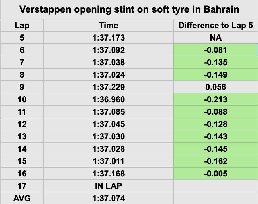
Analysis Verstappen’s first stint on soft tyres with full fuel (RB20 is so gentle on tyres)

Post image
1.1k Upvotes

r/F1Technical • • Feb 26 '23

Analysis Is there any proof from a technical point of view that the AMR 23 could be the best of the rest in 2023?

Post image
1.1k Upvotes

r/F1Technical • • Aug 06 '25

Analysis 2025 Hungarian GP: What really happened to Charles Leclerc? The story the raw lap times don't tell

Thumbnail
gallery
1.0k Upvotes

Hey everyone, I hope you're doing great.

I just published a deep-dive on my site (f1pace.com) about Charles Leclerc's Hungarian GP, specifically focusing on what happened with his performance in the second half of the race. I'll leave the link to my article at the end of this post, but I'll add the main key points here.

One of the issues with most analyses is that they only look at raw lap times, which are influenced by much more than a driver’s pure speed. A multitude of factors come into play, including fuel load, track evolution, weather, tire degradation, and traffic.

In this case, my goal was to look beyond the raw lap times. I built a statistical model to correct for all the usual noise (fuel load, track evolution, traffic) to isolate each driver's "true" underlying pace throughout the race. This allows us to see exactly when a driver started to struggle or thrive—something most analyses can't do because the data is so noisy.

I'm adding an image of the results of my model-corrected analysis, as well an image of the raw lap times so that you can see how they compare to each other. In my model you'll see clearer, more stable, lap times that are mainly based on the impact of tire degradation and the driver’s own input. In the raw lap times you'll see a ton of variation. The first stint is a clear example of this. In this case, the quickly falling lap times are a product of track evolution, not of driver speed. This shows how this "noise" can make our interpretation of the data a lot trickier.

Methodology

For this analysis, my model produced "corrected" results by controlling for the following variables:

Fuel: Corrected. I added back a 0.03-second time penalty per lap, which is a widely used estimate of how much lap times improve as cars burn fuel. This was a straight correction based on industry knowledge. It’s not perfect, but it’s accurate enough for our needs. Unfortunately, without proper data about how each team manages their fuel, there's not much else we can do.

Track evolution: Controlled for. Track evolution was modelled, which means that this effect is not constant, and instead is allow to vary throughout a race. For this comparison I fixed track evolution at the value from lap 35, so we’re comparing everyone on an even surface.

Traffic: Controlled for. I asked the model to predict lap times as if each driver spent the whole race in clean air, with no time lost following slower cars.

With these corrections, the lap times we’re looking at show how fast each driver could have gone if all the outside factors were neutralized. In other words we combined all of these adjustments, and we create a fuel, track evolution, and traffic corrected, view of the race.

Findings overview

Piastri and Leclerc were very evenly matched during the first stint. There was nothing to separate them; they were virtually just as fast. This is evident on the corrected data, although the raw data has Leclerc being a tenth faster than Piastri.

After the first pit stop, in the second stint, Piastri was already faster than Leclerc. On lap 21, Piastri was estimated to be just over two tenths (0.225 s) quicker per lap than Charles. By the end of Charles’s stint on lap 39, Oscar was almost four tenths (0.385 s) faster per lap. The raw data has them dead even (delta of 0.02 seconds per lap between them), but this is mostly because Piastri was in traffic for most of this stint.

As I've said, Leclerc’s second stint was already worse than Piastri’s right from the start, but it got progressively worse after laps 26 to 28. This, coincidentally (or not), matches the laps when Charles complained on the radio about issues with the car’s performance. In the chart you can ses how his corrected lap times start to decouple from Piastri's and get closer to Russell's, meaning he was already struggling.

After the final pit stop, Charles lost all of the pace he had at the start of the race. His lap times completely fell off a cliff, and he was much slower than both Russell and Piastri.

Speculation on what happened

Based on my model's results, I believe Charles was already dealing with issues before his last pit stop. His radio comments suggest the team was aware that plank wear could be a problem and had likely pre-planned power reduction modes to limit compression under load and braking.

Unfortunately, it seems even these mitigation efforts weren't enough. I suspect the team realized mid-race that the car was still wearing the plank too quickly. This is likely when they decided to put over-inflated tires on Leclerc’s car as a last resort, aiming to physically raise the car and save the plank.

This combination created a “double penalty”: Leclerc was left with a car that was both down on power due to the engine mode and suffering from terrible grip due to the high tire pressures.

Conclusion

In the end, while the narrative of the race focused on Leclerc's final stint, the real story of his struggle began much earlier. The output from my model shows that his performance was already compromised in the second stint, a fact hidden within the noisy raw data but revealed by our analysis. The final pit stop wasn't the cause of the problem; it was the final, desperate symptom of an issue the team had been fighting—and losing against—all along.

I'm leaving the link to the full article here in case you want to read it. It has an additional chart, as well as more detailed information on how the model works.

Have a nice day everyone.
r/F1Technical • • Feb 20 '26

Analysis [Giuliano Duchessa] A representation of the Ferrari Reverse Wing, the lift becomes positive, which lightens kg of load on the entire rear end with effects on the aerodynamic platform. This increases straight-line speed.

Thumbnail gallery
619 Upvotes

r/F1Technical • • Jun 18 '23

Analysis What Max's domination looks like in the wet | Telemetry comparison against Hulkenberg

1.7k Upvotes

r/F1Technical • • Jul 31 '24

Analysis Why has Oscar caught Lando so quickly?

485 Upvotes

I cannot remember a time where a driver has so quickly caught up to their established teammate, who is also generally seen as a top driver in their own right. Is it the car, is it Lando, is he just that good or is it just a combination of all 3?

r/F1Technical • • Mar 20 '22

Analysis Bahrain GP Race - Speed Trap

Post image
1.3k Upvotes

r/F1Technical • • Mar 15 '22

Analysis Best mini-section times recorded for each team across the three days of Pre-Season testing 2022

Thumbnail
gallery
1.3k Upvotes

r/F1Technical • • Mar 11 '26

Analysis During the Australian GP weekend cars lost upto 50 km/h at the end of the straights. This simplified 2026 Hybrid model test depicts it.

439 Upvotes

During the Australian GP weekend we saw cars losing up to ~50 km/h at the end of the straights. What actually causes that?

Marie Lubieniecki ran a simplified 2026 hybrid model to explore the effect.

r/F1Technical • • Apr 05 '25

Analysis NORRIS vs VERSTAPPEN Q3 Speed Trace Comparison 🤯

Post image
1.1k Upvotes

this is the definition of "smallest of margins"

r/F1Technical • • Feb 07 '26

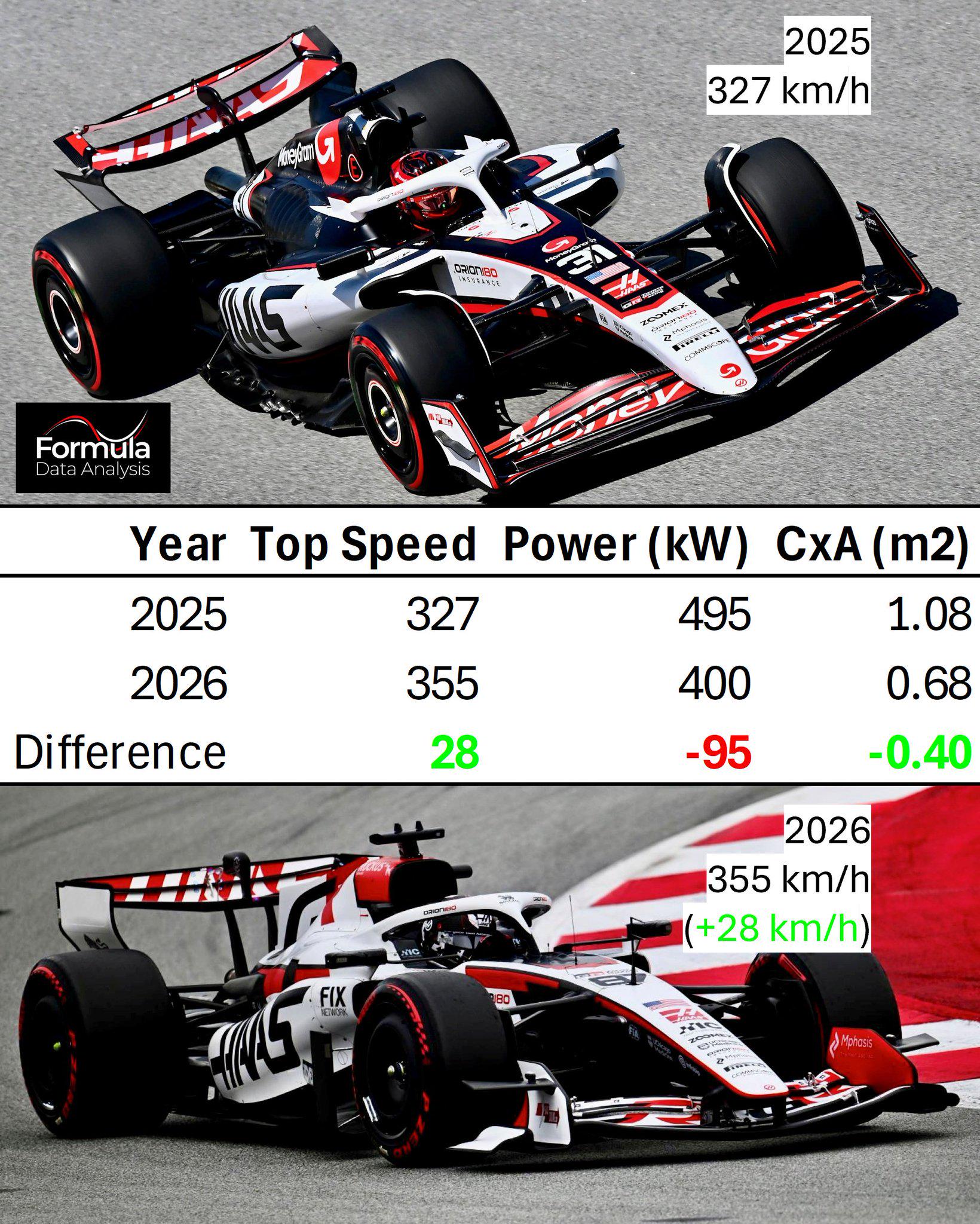
Analysis 2026 F1 cars will be WAY faster on the straights!

Post image
621 Upvotes

Esteban Ocon reached 355 km/h once he was allowed full deployment, and no evidence of slipstream!

In his best '25 quali lap, he reached 'just' 327km/h - and he mentioned reaching the top speed EARLIER on the straight in '26

The drag drop is massive (-37%), even assuming the ’25 car was in full ERS harvest (–120 kW), to be subtracted from ~615 kW ICE power (~840 hp). The ’26 car was +28 km/h faster despite a ≥95 kW (130 hp) power deficit

Back in December, I predicted CxA = 0.66 → 359 km/h top speed, very close to real data (355 km/h → 0.68)

💡At least one (likely both) is true: -The new cars have extremely low drag -Ferrari's new ICE is stronger than F1 predicted (400kW) What’s certain: these cars will fly on the straights - and Catalunya isn’t even low-drag!

[ CxA from drag POWER: 0.5ρCxAv3 = ICEpower@vMax, ρ≈1.22 ]

r/F1Technical • • Nov 20 '22

Analysis [@formuladdict] Qualifying lap time comparison between the top 3

2.5k Upvotes

r/F1Technical • • Dec 05 '21

Analysis Analysis of the Lewis/Max contact

Post image
932 Upvotes

r/F1Technical • • Mar 28 '26

Analysis Analysis on the Suzuka Qualifying per PU manufacturer

Thumbnail
gallery
550 Upvotes

Suzuka qualifying through the lens of who builds the engine.

Five Power Unit manufacturers on the 2026 grid. The violin chart pools every qualifying lap by power unit supplier. What it shows is not just who is fast but how the performance distributes across customer teams sharing the same hardware.

Mercedes powered 44 laps across four teams. Their best of 1:28.778 sits half a second clear of Ferrari's 1:29.303. But look inside the violin. The Mercedes shape is bottom heavy, meaning most of their laps cluster near the fast end. That is four different chassis and aero packages all extracting similar performance from the same PU. The spread from best to worst Mercedes powered lap is around 3 seconds, but the density sits in the 1:29 to 1:30 band.

Ferrari's violin is taller and wider. Three teams, 26 laps, and the distribution is more uniform. That wider shape means more variance between the works team and the customers. The Haas and Cadillac dots sit visibly higher than the Ferrari works dots inside the same violin.

Red Bull Ford is the most compact shape on the chart. Two teams, 19 laps, and the body barely stretches beyond 1.5 seconds peak to trough. Both cars are finding similar limits, which for a brand new PU programme in its first season is notable. Whether that compactness is genuine convergence or just limited data from two teams is worth watching over the next few races.

Audi at 1:29.990 from one team and 12 laps. The shape is tight and centred around 1:30. For a manufacturer building their own power unit from scratch, being within 1.2 seconds of the Mercedes best in qualifying is closer than most people predicted.

Honda with Aston Martin is the outlier. Six laps, 1:32.646 best, and the violin body sits 3 seconds off the pace. Limited running makes it hard to read too much into the shape but the gap to the next slowest PU is over two seconds.

The track evolution by PU confirms the pattern from a different angle. From minute 40 onwards the Mercedes and Ferrari dots separate downward while Red Bull Ford and Audi compress into a band. The PU advantage at Suzuka is not just peak power on the back straight. It is how consistently the package delivers across a full qualifying session when the energy management demands are highest.

r/F1Technical • • Oct 28 '24

Analysis How does McLaren's car come alive during the later stages of the race?

Post image
734 Upvotes

Hey newer fan here. This season it seems towards the later stages of the race the McLaren becomes the fastest car on the circuit. Curious what all contributes to this? Is it the best on tire ware? Is the car package setup to be optimized when fuel is low? Is it because all the cars are spaced out more and their car really thrives in clean air? Last Lap Lando? All the above? Or something totally different?