r/MapPorn • u/geosunsetmoth • Aug 21 '26
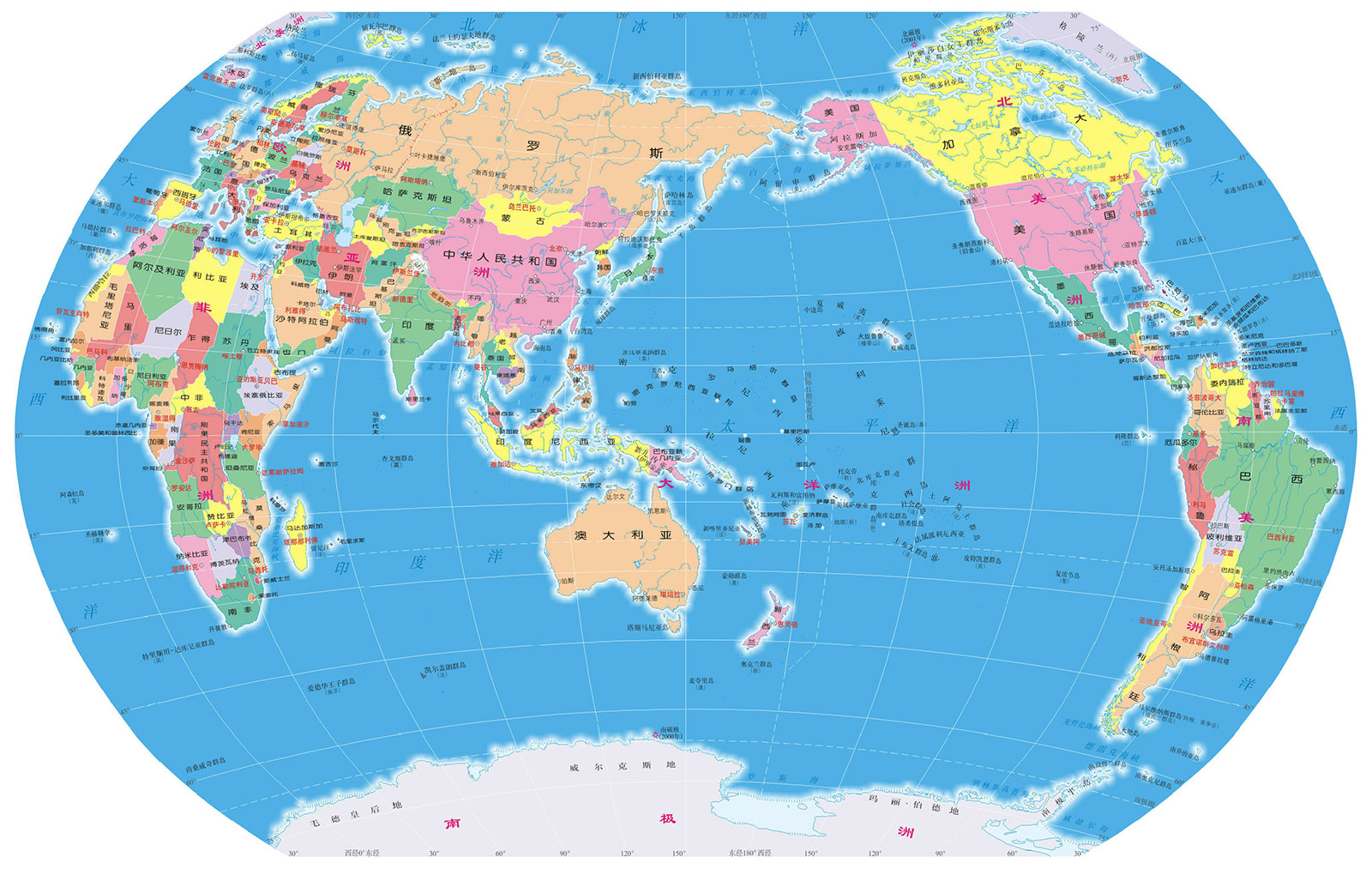
To illustrate how geopolitics shape our choices of projection and in turn how we see the world, the Brazilian Institute of Geography and Statistics created this unorthodox (but not incorrect) map where Brazil is centered and South America is "on top" of the world
236
u/Garras-Intruder Aug 21 '26
Flipping the map is 100% correct too, yes, but all 2d maps of a sphere will have distortions
100
u/geosunsetmoth Aug 21 '26
Yes! The idea is that when we project we always introduce distortions, and we need to decide what to distort and what to preserve. The map illustrates that there is not one "correct" way to make these choices, and a map that makes different choices is not inherently incorrect
11
14
u/ogetarts Aug 21 '26
It illustrates that the maximum distortion is either in the middle of the huge and empty Pacific Ocean, or somewhere more relevant to almost anything you'd want to discuss in geography.
Which of course doesn't invalidate this map or any other: It's great to have them. But there are objective reasons beyond geopolitics for the current standard to be what it is.
1
u/Civil-Appeal5219 Aug 21 '26
Is it correct though? Not an expert in any way, but wouldn't the shape of the countries be different, since the projection "deform" your territory based on which part of the map you fall into?
9
u/trampolinebears Aug 21 '26
Every projection deforms shapes or sizes or distances, usually several at once. That's just how projections work.
Some projections try to average out the distortion so everything is equally wrong. Some try to focus the distortion so one area is close to correct, while the rest is much worse. Some get the sizes exactly right while messing up the shapes. Some get directions exactly right while messing up areas.
1
u/Civil-Appeal5219 Aug 23 '26
That’s my point. Greenland would be distorted differently in its traditional position in the world map than it would be in this upside-down one. This map just turns the countries upside down and call it a day, instead of recalculating their distorted shapes in their new position
1
-4
99
u/Easy-Reporter4685 Aug 21 '26
I think people who are talking about continent splitting are missing the point. It’s about how we interpret the map. With the map this way up the importance of the south Atlantic (where is says “Amazonia azul” or “blue Amazon”) increases drastically. As Brazil there’s now a “geopolitical logic” towards reaching out to South Africa, Angola and Guinea Bissau to “control” that part of the ocean. When the map points north what I’ve said is much less obvious because the South Atlantic seems like a tract of no strategic importance.
49
u/Zrttr Aug 21 '26
Argentina's on top of us, I hate it
33
u/Basic-Organization73 Aug 21 '26
as long as they bouncce on my meat, they can be on top all day long
20
2
1
u/MartinIsland Aug 22 '26
You’ll have to ask my boyfriend, but as long as you’re nice I’m fine with it!
4
36
u/Rivinick Aug 21 '26
For a map subreddit, there's a lot of people here who don't seem to know the different uses of a map (some also don't understand perspective)
10
u/Sandman145 Aug 21 '26
i found it funny how many starndard projection defenders we have here. i love it when some ppl get mad about the political side, but then try and use logic (faulty) to justify their dislike of the map.
i'm brazilian i love it.. looks ugly af tho.
12
u/Eldariasis Aug 21 '26
Dev of a strategy game should present the map like that once. No warning. First players are going to hallucinate for a minute.
6
u/matheushpsa Aug 21 '26
I don't know if what he told me is true, but a colleague who was an officer in the Brazilian armed forces said it was quite common to hand out "unusual" maps and charts during tests and training exercises to assess whether the military personnel had actually learned the basics of cartography or were simply "relying on memory."
238
u/Gentle_Snail Aug 21 '26
Maybe its a controversial opinion, but whenever I see maps like this where near half of it is made up of the mostly empty pacific and major continents are split up, it does make me wonder if the traditional map view might be the standard for a reason
119
u/HarryLewisPot Aug 21 '26
Centre Africa or China, there’s no other option imo.
You gotta either choose between a tiny bit of Russia or Greenland to be split, but not a whole continent.
58
u/ngfsmg Aug 21 '26
If you center Florence the anti-meridian passes through the Bering strait and you split no big landmass
12
3
u/RFFF1996 Aug 22 '26
China is wonky too cause it forces you to include all the pacific which is too big
5
u/Sandman145 Aug 21 '26
that's just asthetics. this map is ok if you want to show something in the oceans for example, i know there are better for that, but the point is that maps have their reasons for being.. this one's reason is a statement.. do you really think the 0 paralel passes through england because it looked good?
science is not devoid of politics.
5
u/geosunsetmoth Aug 21 '26
It could be decently useful that any map that needs to focus on oceans, for some reason. Look how when splitting the world this way, you actually have the pacific on one side, the atlantic in the middle, and the indian on the other. Would be a great map to compare the habitats of species in the three larger oceans.
2
4
u/SuintilaRexGothorum Aug 21 '26
You are overlooking the fact that, in 2026, there are people who like to deny the obvious.
5
u/BayLeafGuy Aug 21 '26
so why china is not in the center? it's also a very pratical way to make world maps (better than the europe centered ones in my opinion).
0
9
u/M45t3r_M1nd Aug 21 '26
You're implying that north-up maps have less ocean, which is untrue. If you flip the map (seriously, rotate your phone), you will see that there is the exact same amount of ocean vs land as south-up.
17
u/WorriedHovercraft28 Aug 21 '26
No, he’s not talking about north up. He’s talking about putting America in the center. If it were to the side, like in a regular map, but flipped north up, the cut would be in the Pacific Ocean, which is mostly empty, instead of in the middle of Asia with Russia in china sitting in both opposite sides, which is ridiculous
21
u/Gentle_Snail Aug 21 '26
I’m not talking about the north south switch, I’m talking about the shift of the X axis
-9
u/M45t3r_M1nd Aug 21 '26
South-up maps that center on countries such that landmasses are split are not the standard. Here's an example of a south up map that has contiguous landmasses.
This map is only useful (obviously) for Brazilians, and it succeeds at that.
17
53
u/JustHereToSeeTitty Aug 21 '26
They're only implying that if you're intentionally trying to miss their point.
They're saying it's more important for landmasses to be contiguous on a map than for empty ocean to be. This map dedicates a lot of space to displaying the Pacific in full and then cuts China, Russia, Indonesia, Australia etc.
-5
u/M45t3r_M1nd Aug 21 '26
That can easily be solved by centering the map on Africa or Australia.
Is the issue a map centered on Brazil? Because I think it's well-understood that this is a stylistic map by and for Brazil, not the rest of the world. No one is seriously arguing that a south up map of Brazil should be the standard.
What can be seriously argued is if south-up maps in general are valid and useful for contiguous landmasses, which they are, so long as the map is centered on Africa/Aus. This map isn't because that isn't the point of a Brazil-centered map.
Of course you're gonna split up landmasses if you have a Brazil-centered map.
23
u/JustHereToSeeTitty Aug 21 '26
I don't know why you're so randomly focused on proving the validity of it being south-up when neither the comment you replied to nor I mentioned that at all.
South-up or north-up is obviously nigh identical ocean-wise — even if I'd argue north-up is still better because our eyes tend to trend top-to-bottom, so putting useless space at the bottom tends to be smarter. We align text on a page left, we sometimes align it right in some languages, but we never align to the bottom of the page. Same principle but it's not a huge deal.
I don't see the argument, in the sense that I don't know who's arguing this. Of course a south-up map is valid and can be useful, the question is... why would you? The only answer I've seen so far can be summarised as "nationalist sentiment" and I don't know why anyone in any form of academia gives a rat's arse about that.
2
u/LeedsFan2442 Aug 21 '26
That can easily be solved by centering the map on Africa
That's what they are saying!
4
u/Independent-Yak-220 Aug 21 '26
yes and the reason is eurocentrism, maps have different uses and applications
-5
Aug 21 '26 edited Sep 16 '26
[removed] — view removed comment
1
u/LordJesterTheFree Aug 21 '26
"No sovereign nations in the middle of the Atlantic"
My God I thought we just had the world cup has everyone already forgotten about Cabo Verde?
1
u/Guaymaster Aug 21 '26
Cabo Verde is small enough that you'd have to purposefully split its islands. That said you'd definitely cut Greenland no matter where you make the cut (under the assumption that you don't want to circumcise either Africa or South America).
0
-1
-3
u/notanybodyelse Aug 21 '26
The Pacific isn't empty. People live in each of these places, most nations comprising several inhabited Islands.
New Zealand Pacific scholar Ron Crocombe, considers the phrase Pacific Islands to politically encompass American Samoa, Australia, the Bonin Islands, the Cook Islands, Easter Island, East Timor, Federated States of Micronesia, Fiji, French Polynesia, the Galápagos Islands, Guam, Hawaii, the Kermadec Islands, Kiribati, Lord Howe Island, the Marshall Islands, Nauru, New Caledonia, New Zealand, Norfolk Island, Niue, the Northern Mariana Islands, Palau, Papua New Guinea, Pitcairn Islands, Samoa, the Solomon Islands, Tokelau, Tonga, Tuvalu, Vanuatu, the Torres Strait Islands, Wallis and Futuna, Western New Guinea and the United States Minor Outlying Islands (Baker Island, Howland Island, Jarvis Island, Midway Atoll, Palmyra Atoll and Wake Island).
List_of_islands_in_the_Pacific_Ocean
The standard is what works where somoene is. Your standard doesn't work here.
28
u/geosunsetmoth Aug 21 '26
They also make sure to color-code it in a somewhat arbitrary set of qualifiers that made sure Brazil was the only country in all highlighted categories. To, again, illustrate how everything in a map is somewhat up to the decision of the map-maker and different choices can privilege or undermine some countries even if unintentionally. Same reason why the three highlighted points of interest are somewhat arbitrarily picked as the location for events that happened in Brazil or the headquarters of organizations Brazil is a part of.
4
u/cafe-vitor Aug 22 '26
The "arbitrary" qualifiers are because this map was made FOR those events and to make more global propaganda for them. we hosted 2 big ecosystem conferences in the same year (2025) and we were the center of the conversation, no bad intentions there.
12
u/u46 Aug 21 '26
Malvinas (not Falkland) on Argentine coast. This is a strong political statement as well
5
1
u/LutadorCosmico Aug 21 '26 edited Aug 22 '26
Yep the origin of this map is not exactly "neutral" in political sense. It comes from the current Brazil (left) administration and it carries some of its political agenda, like anti-colonization narrative.
Source: Im brazilian.
6
u/DadCelo Aug 22 '26
To be fair, I think this has been the stance of every Presidency in Brazil for a while.
5
4
u/Long_Reflection_4202 Aug 21 '26
"I have called this 'The School of the South' because in reality, our north is the south. There must not be north for us, except in opposition to our south. Therefore we now turn the map upside down, and then we have a true idea of our position, and not as the rest of the world wishes. The point of America, from now on, forever, insistently points to the South, our north."
-Joaquín Torres García
20
u/MBpintas Aug 21 '26
You guys have no idea how angry brazilian "PATRIOTS" got over this map when it came out last year
4
u/Background-Vast-8764 Aug 21 '26
What are the problems with it in their view?
12
u/Gold_Ambassador_3496 Aug 21 '26
"leftists are teaching our children wrong and wasting government money in useless things"
4
u/Sandman145 Aug 21 '26 edited Aug 21 '26
they like being vassals to the US empire. they dont like we're part of BRICS, if it where for them and thier politicians we would probably enter some very shitty economic org with the US/Europe. there's more, but it's way too much.
3
u/Hodorization Aug 21 '26
Sounds like people who want to profit from emiserating their fellow countrymen?
I bet Trump and MAGA give them lots of money
5
u/TheAwesomePenguin106 Aug 22 '26
I'm absolutely not joking: lots of them openly wish that the US launches an invasion here in Brazil.
One of Bolsonaro's sons is the key driver of the tariffs imposed by the US against Brazil.
2
u/Hodorization Aug 22 '26
What's their stance on Brazil's abolition of slavery
1
u/TheAwesomePenguin106 Aug 22 '26
Bolsonaro has made some awful comments about this, and whatever he says... his followers agree.
He denies the existence of a historical social debt by the state to the black population, stating that he didn't enslave anyone and that black people in Africa were responsible for the human traffic, because "Europeans never set foot in there".
He has also criticized Brazilian laws against modern slavery, stating that they are too rigid. He thinks that it's absurd to expropriate lands where modern slavery is being used.
1
u/Hodorization Aug 23 '26
I can see how he has lots of fans among the edge lords and racists. Thanks
4
8
u/Bourriks Aug 21 '26
There is no incorrect map. You choose the center you want, and it's logicial to center your own country.
And you can even put east or west on top, whatever, if the compass is correct.
3
u/Pitiful_Newspaper_25 Aug 21 '26
I'll save it not because I care about any context it has, but because it looks as an absolute banger for a fantasy map
6
u/Routine_Ad_2695 Aug 21 '26
My western Eurocentric mind:
8
u/LeedsFan2442 Aug 21 '26
I think Asians probably have a bigger issue.
I find this argument funny as a Euro-centric world map is also Afro-centric.
5
u/AynidmorBulettz Aug 21 '26
goddayum people rly are foaming their mouths over a map whose purpose is purely demonstrative n not intended for real world use
17
u/AleksandrNevsky Aug 21 '26
People say all projections are equally valid and it's just a matter of perspective and bias but this one just seems inefficient for little reason. A lot of the space is taken up by empty ocean and it divides large land areas. All it really does is highlight how much better the standard version is. Like China, Indonesia, and Australia can and should be whole areas but they're split by this version. It's better to divide the oceans than it is to divide landmasses.
36
u/co209 Aug 21 '26
This map projection is good because it represents a relation between all countries of the world and Brazil. It only makes sense, then, to centralize Brazil and show how yhose relationships radiate from it.
33
u/geosunsetmoth Aug 21 '26
Depends on what you're using the map for. Would this map work for a classroom in Nepal? Would probably not be very good. Would this map work as a proof of concept to teach Brazilian students about projections? Yeah it's pretty decent for that.
-29
u/AleksandrNevsky Aug 21 '26
Would this one be an example of really terrible projections and why people use better ones? That's the only utility I can see with ones like this.
23
u/geosunsetmoth Aug 21 '26
I mean... Even outside of an educational environment, this would be a very good map to use if, for instance, you want to study common navigation routes for ships travelling to Brazil from the Atlantic, especially from Africa. Or if you need a map with a quick-and-easy way to tell any place's distance to South America without having to worry about whether it would be shorter to "wrap" around the map. Or if you want to showcase the effect of the American continent on wind and ocean currents. Or... well, you could go on. This is just off the top of my head.
-19
u/AleksandrNevsky Aug 21 '26
Sounds very niche at best. And that would still be utilized better with a traditional north-up orientation that's just offset to center on The Americas or Brazil specifically.
11
u/geosunsetmoth Aug 21 '26
Why's north-up better?
-6
u/AleksandrNevsky Aug 21 '26
Because it's the map orientation that most of the world uses, so it's easier to interpret data from one to the other using common frames of reference.
Like stuff like this is a "huh, neat" kind of thing but for actual utility it's mid at best.
10
12
u/YoungPotato Aug 21 '26
This is a Brazilian map lol. I’d assume the map is to interpret Brazils place on a map, mainly for a Brazilian perspective.
Despite how offended you are, this map isn’t any more wrong than any other map. A map only needs a legend, scale and compass to be interpreted correctly.
There are also South-up and East-up maps that “divide” the world where land isn’t cut up. Those might be to your liking and comfort.
12
u/M45t3r_M1nd Aug 21 '26
NOPE. North-up maps have the same proportion of land vs ocean as south up maps. Just rotate your phone.
As for dividing land masses, your critique lies on where the map is centered rather than the directionality. You can solve this by centering the map on Africa or Australia.
3
2
u/Catteine Aug 21 '26
For some reason seeing Antarctica on top feels really weird. Not anything else, just this.
3
u/ZWintersun Aug 21 '26
Where is Chile?
17
4
4
u/flavorizante Aug 21 '26
Only countries that are part of one of the listed alliances (bottom right) are labeled on this map.
2
u/Sandman145 Aug 21 '26
funny to read up all the standard projections defenders like the ppl that made this map where trying to make a new trend or something. pure gold watching the gringos mad about a map projection that's clearly just a political statement more than anything.
8
4
u/FloatingWalls1 Aug 21 '26
In this map, huge population centres are in the “spill over” area where they end of the left and restart on the right.
Our standard map is much more legible as the spill over regions are sparsely inhabited areas of far east Russia, Alaska, and pacific islands.
2
u/Hanuser Aug 21 '26
I'm just surprised the Brazilian institute was ok with Argentina sitting on top of them at the pinnacle of southness.
3
u/Yearlaren Aug 22 '26
Argentina and Chile are the pinnacle of southness. They reach further south than any other country,
3



2
u/gustabomfim Aug 22 '26
Lugares mais sérios estão enviando satélites e tecnologia para o espaço com finalidade prática e tecnológica. Aqui estamos dando 180° numa imagem.
1
u/Silent-Laugh5679 Aug 21 '26
I am European and I really like these maps. I wish it were also an equal area map. The only thing I do not like is that the Falklands are in Argentina.
7
u/Guaymaster Aug 21 '26
You'd kinda have to move them from the Argentine Continental Shelf for that effect. This map is not showing political sea borders outside of Brazil's own sovereign waters, it's not a political statement, they are just in comparatively shallow water.
1
1
1
1
1
1
u/Xitztlacayotl Aug 22 '26
I hate these south up maps. They just feel wrong even if they are correct.
Looking at it my brain just tries to flip it back up. It's like trying to read ndsᴉpǝ poʍu ʇǝxʇ.
It's just what we are used to.
2
u/MangelaErkel Aug 21 '26
Nice point, bad map.
If the centwr point is mostly empty ocean its a bad map lol
1
0
u/RubOwn Aug 21 '26
There is a reason why we divide the maps through the Bering Strait... or the Atlantic if youwant to center it on the Pacific.
1
u/Legitimate_Carob_485 Aug 21 '26
Ended up unintentionally highlighting how big the Pacific Ocean is and how much South America is isolated from every other continent, probably not the original goal.
1
u/em3am Aug 21 '26
Where to tops process? At the top. Where does the Earth process? At the top, that is, the North.
1
1
u/vctrgbrl Aug 22 '26
I am Brazilian and I fucking hate this map, even more the fact that it was created by an official Brazilian institute
-11
u/jmorais00 Aug 21 '26
As a Brazilian, I think this is shit. If you want to focus on Brazil make a map of Brazil. If you want to focus on the world, make a map where most of the prime real estate isn't empty. It's a known rule in design that humans read first the top left, then the top right, thee bottom left, bottom right (if you come from a culture that reads like this, as we Brazilians do). So this map really is shit
10
u/geosunsetmoth Aug 21 '26
What if you want to focus on how Brazil geographically relates to the rest of the world?
-1
u/KiMnuL Aug 21 '26
It was great the way it was before, just slightly centralize the country, this is peak political stupidity, I'm also Brazilian..
0
-2
u/cursed_tomatoes Aug 21 '26
Funnily enough, a number greater than zero individuals actually thought about using this... Can you imagine unnecessarily making a map hard to read because of nationalistic ego?
While a point can be made about how our standard cartographic projections are cultural byproducts, it is quite the obvious one, and the self evident doesn't needs to be stated. Anyway, no one uses this at all, this was released in 2025 as a political ideology manoeuvre that basically no one cared about.
If I'm not mistaken, not the first country to pull this one.
-4
u/JackAlexanderTR Aug 21 '26
Upside down is fine, but please make the cutoff at the Bering Strait as its weird for a map to split land area like that.
Our planet gave us a nice way to split maps with the Pacific and Bering Strait as natural cutoff lines.
0
0
-2
u/InvisibleWatcherExo Aug 21 '26
As a brazilian, this map outrages me. By the simple fact that Argentina is on top of Brazil. Outraging.
-1
u/ZessF Aug 21 '26
Turning it upside down is pointless though. It's common sense, not geopolitics, that makes us orient most of our maps with north at the top.
4
-1
u/AnyBallLektor Aug 22 '26
This is stupid ideological posturing and this map proves that very point.
The standard projection is reflecting geographical reality - majority of landmass is north and until very recently majority of population was north.
Maps also serve to plot travel not educate about the world. Therefore deforming projections were better because they made plotting easier.
If you want to study the world buy a fucking globe because that's the realty reflected most accurately in a study prop.
But that's too much effort directed to thinking for whoever invented this re+arded map.
1
u/Free-Golf3172 Aug 26 '26
No. The standard projection was made to show europe at the center and top of the world. The world is a globe, so there ain't no north or south.
-10
-3
-7
u/Fit-Skirt5493 Aug 21 '26
agora o norte e pra baixo, bom pra ensinar o povo a se perder
5
u/geosunsetmoth Aug 21 '26
Mas o norte não é nem pra cima nem pra baixo.
-1
u/Fit-Skirt5493 Aug 22 '26
tenta seguir qualquer mapa no mundo com essa logica
3
u/geosunsetmoth Aug 22 '26
Eu não preciso por que qualquer mapa no mundo vai dizer “Norte” e “Sul”, não “Cima” e “Baixo”
-17
263
u/matheushpsa Aug 21 '26
As a Brazilian, it is worth noting that the overwhelming majority of maps produced by the IBGE—as one would expect—do not follow this pattern; here, the map serves as an instrument of geopolitical assertion (Global South, "the South is my North," etc.) as well as an educational tool (several teachers have told me it is an excellent map for introducing relevant geographical issues in the classroom).