r/ArtCrit • • Sep 07 '26

FINALLY! The Place To Sell Your Art And An ArtCrit Casual Sub By Yours Truly

26 Upvotes

You asked for it.

We heard you.

We delivered!

In our last news update we touched lightly on how much your words of encouragement mean to us. The sub has grown tremendously in the past year and we couldn’t be happier to see you all giving constructive feedback to one another.

We’ve also heard the people who have enjoyed our moderation style, but wanted something more lighthearted and discussion-focused. We’re also well aware that there’s a lack of subreddits where people are allowed to self-promote and advertise.

That being said, I’m happy to introduce our two new subs!

r/ArtistNook is a casual, cozy, discussion-focused sub moderated by leighabbr and myself. While r/ArtCrit has strict rules on posts, r/ArtistNook is much more laid back.

You can share information, talk about your artwork or OCs, post your work with links to your social media, and even ask for pricing help if you share the required information so people can actually help you with your prices.

This sub has been up for about two weeks, so there’s some light activity already.

We can’t wait to see you there!

r/ArtStore is an active, large sub focused on connecting artists and buyers. You can self-promote, sell your prints, advertise your commissions, shops, and handmade goods. We do not allow drop shippers or mass-produced goods of any kind.
With the holiday season approaching, this may be just the sub you need to get eyes on your work!

Leighabbr and I are so honored to be leading these communities. We’re still fine tuning them both and, like when we took charge in r/ArtCrit, we’re open to ideas and feedback.

Thank you all for your continued support! We honestly couldn’t have gotten this far without you!


r/ArtCrit • • Sep 01 '26

STUDY SERIES Study Series: Part 2 - Composition

Post image
3 Upvotes

Welcome back to the Study Series!

Moving away from values and contrast, we’re moving into the next important part of your work – composition!

Composition is the way an artist arranges the pieces of their image to help guide the viewer’s eyes where they want it to go. A strong composition can be used to create a specific mood, tell a story, create balance, and direct attention to important areas of the piece.

For those commenting, think about where your eye goes first when you look at the image. Does it feel balanced or does the image seem to “lean” to one side? Are there any distracting areas or does anything feel crowded or awkward?

Let’s work together to create stronger pieces with composition!

REQUIREMENTS FOR POSTING

Please note that all general sub rules apply (no AI, no fishing for compliments, no giving personal info, etc). Only our post requirements are different here.

- Pieces must;

a) Be no more than 6 months old and/or

b) Must still be being worked on and/or

c) Must have the intention of being recreated.

- Works must follow our NSFW rules.

- Since no context is required in these posts, draw and paint-overs are automatically expected. If you don’t want these, say so.

GIVING CRITIQUE

Only critique the piece regarding the topic of the week. If the artist would like additional critique, they can make a post in the main sub. Critiques are still expected to be constructive and polite.


r/ArtCrit • • 37m ago

Comic book artwork

Thumbnail
gallery
• Upvotes

I feel like I'm close to be able to put out professional level comic book artwork after many years but something in there just doesn't feel right and I'm not sure what it is. Take this example, this is my latest piece. It does feel in my eyes that is almost good but something is holding back. I suspect the hair and the items on the door aren't helping, but maybe there's something else in there I'm missing. I need extra eyes on this, I've been looking at it for too long and can't even tell anymore. I have a thick skin, please gimme your fierce, unfiltered criticism. I've included the inking alone because the color scheme can hide mistakes. Appreciate any help.
(Apparently I have to include the word reference in the post otherwise it gets deleted. Yes, I have used references for the frigde and the figure.)

r/ArtCrit • • 4h ago

Please critique my colored pencil process

Thumbnail
gallery
4 Upvotes

Eyes are wonky in this piece but the main advice I want is for the coloring process.

This is a digital drawing, but I used the same process I use for real colored pencils and I used digital to document my process. After I clean up my sketch, I do a light flat coloring of the average color I see for that area, but leaning towards the lighter value range. Then I do a shadow blocking like in my graphite drawing. I then do a value drawing using a mid color value like I would for a painting. Afterwards, I go over my shadows and darker mids with the darker color I see.

At this point, I genuinely start winging it and I just put color down in the areas I see on it the reference and try to make form out of it lol.

Then I stumble into the finished product you see here. I don't work with color often and very rarely with colored pencil, so I would really appreciate someone telling me everything wrong with what I'm doing.


r/ArtCrit • • 2h ago

Help on compo and colour. Working on this on and off for two years

Thumbnail
gallery
3 Upvotes

I’ve been working on this painting for the past two years on and off. I’ve completely remitted and painted over it many times and I’m kind of lost right now.
The first picture is its current state. The second is a sketch I made using my iPhone of how I might finish it and the third picture is a very Inbetween stage. I had a few months ago that I painted over and now I kind of miss as I think it had something special with the Green and the colour.
in general what I’m trying to achieve is to create a real life Minecraft nether portal. this painting is two metre tall.

The current stage I like because it looks like there’s a world behind a window but I think that it still needs work in terms of composition and I might add a Green as in the reference picture I show in the second slide.

What are your impressions of this? What should I pursue in terms of composition and colour? Do you like the idea of adding Green even if it moves away from the original Minecraft reference?
Do you see the world with House and tree trees in the centre or is it not coming through?


r/ArtCrit • • 1h ago

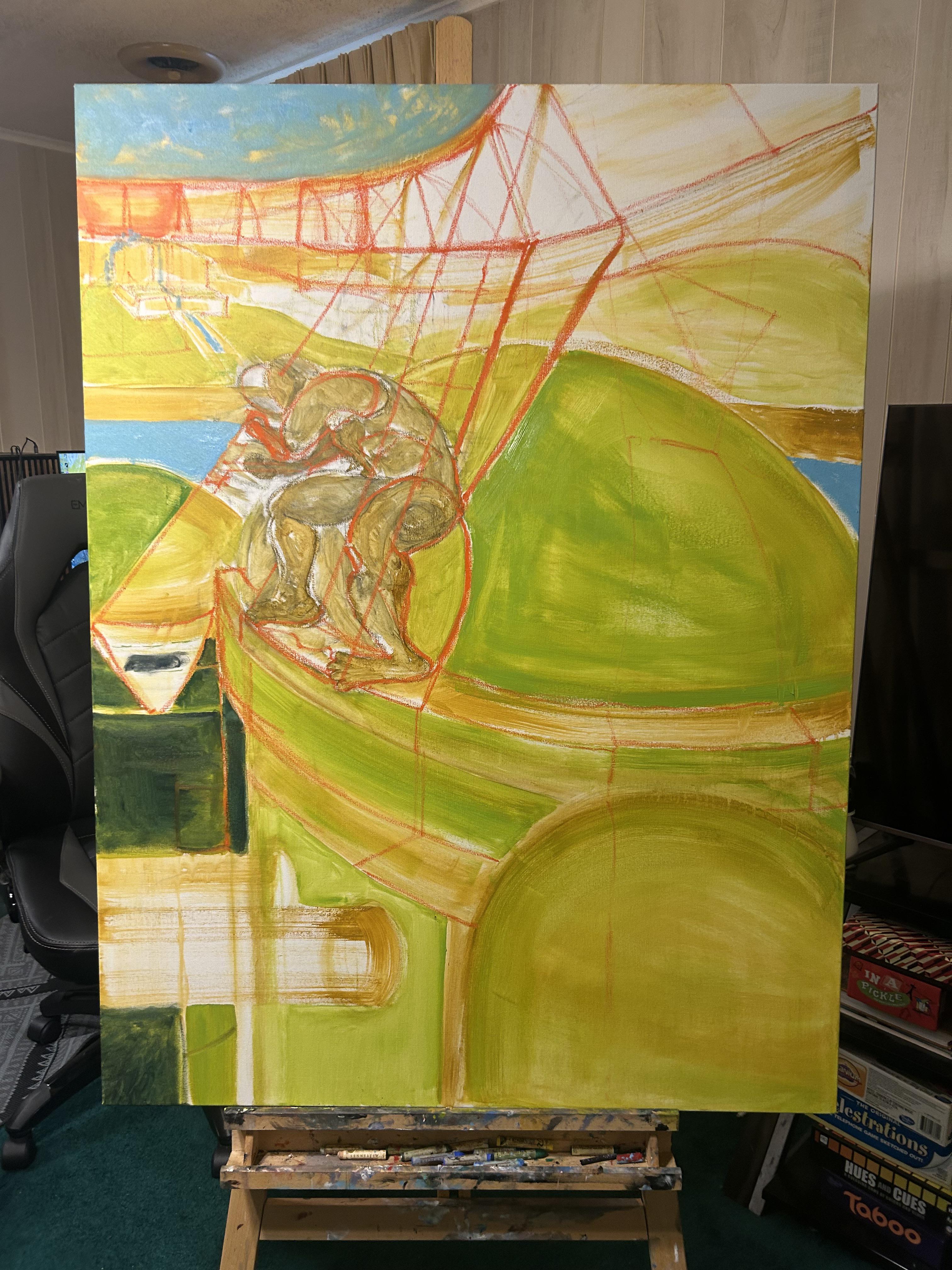
UPDATED WORK I have put my idea on canvas, this weird human ai series.

Post image
• Upvotes

This is the first in a series I am planning, and I am seeking advice for this and future paintings now.

I used zero reference for this painting.

I want critiques on composition, visual hierarchy, color choice and the figure.

The foreground is looking out/over at the buildings/viewer could be standing on one, mid ground is figure. Background is leading to a place of wealth in this strange world.

Thanks!


r/ArtCrit • • 7h ago

Portrait sketches I did on the train

Thumbnail
gallery
6 Upvotes

What things should I try to focus on the next time I do this? Couldn’t find the reference I used for the guy in the top right lol.


r/ArtCrit • • 6h ago

UPDATED WORK How do I make her look like she belongs in the Pokemon artstyle

Thumbnail
gallery
4 Upvotes

I think I posted here before, but that was a while ago. I remember the critiques everyone gave me, it took me awhile to remake her, because my phone stopped working, still don't have one so I made this on my computer using Kleki.

I also watched all of Rjamez Valdez's videos on how to mimic the ArtStyle, though I'm still not satisfied with how she looks.


r/ArtCrit • • 6h ago

Why do I feel like the sketch looks better than the final version?

Thumbnail
gallery
3 Upvotes

I drew Orie from Under Night In-Birth, along with Thanatos. The concept is a bit loose, but it looks like they’re on the verge of a battle. I used quite a few references to arrive at this result. Thanatos isn’t the main focus of this piece, so I didn’t put as much detail into her, I’m not understand the lore, but I’ve gathered that Thanatos acts as a sort of "stand" for Orie.

Since this started as a sketch, I didn’t focus much on the line art. I later moved the art into another canva size because the original canvas was too small to fit Orie’s entire sword. Once everything was finished, I felt that Orie’s face didn’t turn out as good as it looked in the sketch

and If you notice anything else that could be improved, please let me know


r/ArtCrit • • 5h ago

honest advice? my first time trying realistic portraits

Thumbnail
gallery
2 Upvotes

this is a reference from halftone studio. the drawing took around 40 minutes and i just used a lead pencil. i want honest feedback on improvements. i have no idea how to render the hair so any tips on that would be appreciated.


r/ArtCrit • • 10h ago

Does this sketch need to be moved up some?

Post image
2 Upvotes

Does the bouquet look ok where it’s placed on the canvas or is it in a weird spot?

The reference image was a wedding bouquet of a friend


r/ArtCrit • • 22h ago

Painting critique

Thumbnail
gallery
16 Upvotes

I’ve been working on this painting and have been struggling some. I had a hard time getting rid of the glare/distortion, so I have two pictures of it. The reference is at the end.
I’m basically looking for any suggestions to improve it. Specifically, I’ve struggled with the faces a lot and am not sure how to nail them down. Do the overall shapes and proportions of them seem okay? I’m not sure if his head is quite the right size or in the right spot. Also, how is the background feeling? I’m not sure how much I should render it and how much I can leave it a bit loose/painterly. Any other glaring issues or other suggestions?


r/ArtCrit • • 15h ago

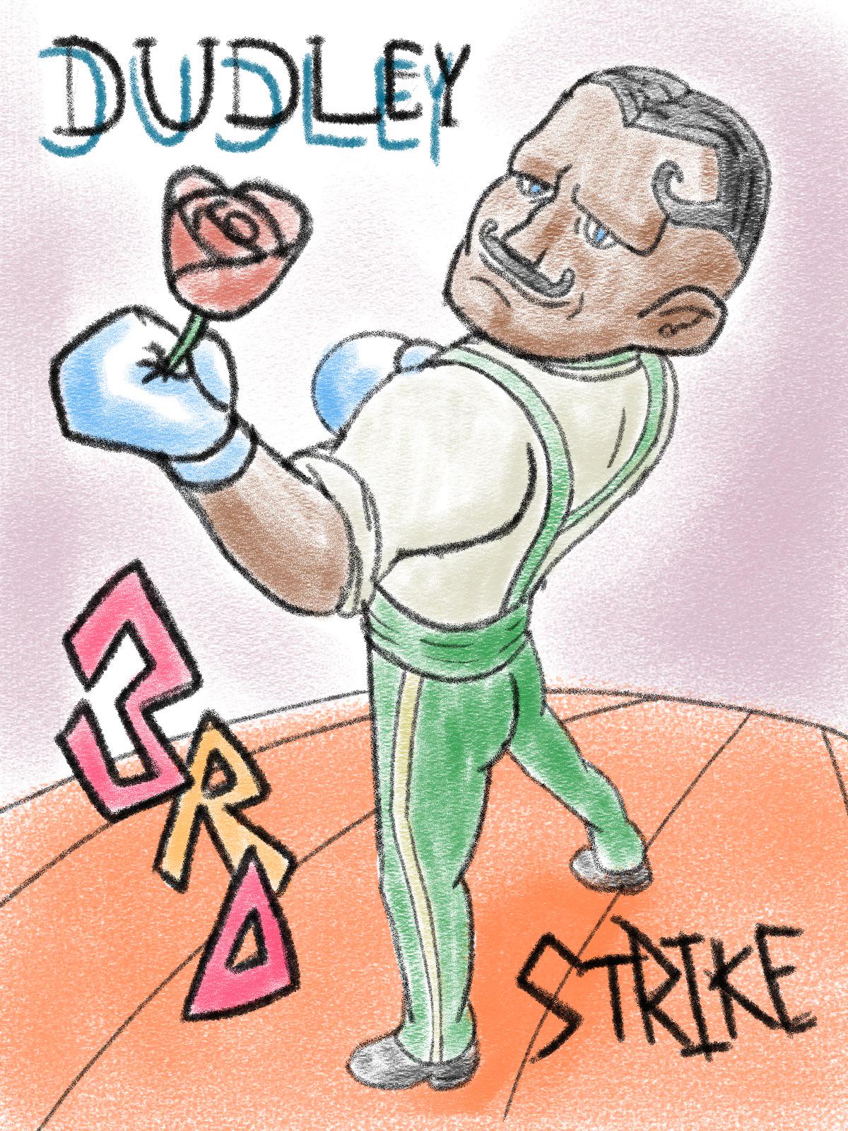
Made street fighter artwork to practice colouring

Post image
2 Upvotes

I don’t really colour too often, so I decided to make this as a means to practice. I’m interested in seeing what I did right, and what I can improve, mainly in terms of colouring and rendering.

I didn’t use any references apart from reference photos of Dudley from Street fighter 3-4


r/ArtCrit • • 23h ago

Need help with proportion and anatomy

Thumbnail
gallery
6 Upvotes

I’m trying to improve on my proportions and anatomy and I’m a lot better than I used to be but I always get stuck when it comes to stuff like this. I tried looking for a reference but haven’t found any. since Kyoshi (the woman on the far right) is canonically 7 feet tall I want her to be bending down with an arm wrapped around her. I’d appreciate any criticism or tips

NO REFERENCE USED


r/ArtCrit • • 1d ago

Just started drawing, anything I could improve on?

Post image
7 Upvotes

I’ve just started drawing, is there anything i could improve on? I didn’t use a reference , would it be better to use one?

Thanks for any help!


r/ArtCrit • • 1d ago

How do I make this cat black without actually colouring it?

Thumbnail
gallery
37 Upvotes

I want to make this cat look black without just colouring all over it using only pencil. I think I'll just waste time and it'll become messy, also I wanted to try with more smart technic way. There is the reference I used and I wanted the shiny fur from the second cat. Thank you!

(Open for critics of how to improve my art)


r/ArtCrit • • 1d ago

Looking for human(oid) anatomy tips

Thumbnail
gallery
4 Upvotes

Generally looking for anatomy and perspective tips on the first drawing, i did not use a reference except for my older art (which i am not sure if i had used a reference for). The other two are other examples of what i can do, please mention anything else that sticks out, thank you!


r/ArtCrit • • 2d ago

Do I over-render?

Thumbnail
gallery
20 Upvotes

No reference. Someone responded to a post about my portfolio saying that I over render my artwork.. Is this true? I am inspired by the rending style of splash art and my own creative twist. Please let me know how I can improve!!!


r/ArtCrit • • 1d ago

How would I go about rendering this

Thumbnail
gallery
6 Upvotes

I put down my base colors some shadows and the lighting but I don’t really know how I can further add to it to increase the contrast and get better rendering I did alter things from the reference like the sword placement and the head placement so the lighting isn’t exactly the same but I feel that the piece still feels flat no matter what I do


r/ArtCrit • • 2d ago

UPDATED WORK Working on my first realistic eyes (two photos art my art, third is ref)

Thumbnail
gallery
9 Upvotes

I’m back, and I drew this, this morning. (Yes, “this, this” because this is English, and English totally makes cognitive sense)

I took some advice from yall and started to work on it again first photo is the eye under a light, second is under sunlight (the little glare at the bottom is from the sunlight not design). This time, I worked from what I remembered from trial and error from the other and used that third reference photo for highlights inspiration which promptly turned into what you see now. I made the pupil smaller, iris rounder(it started out as a perfect circle but then it got a little wonky while coloring in. I used two pencils to create my own compass type thing. Worked out well after a few tries.)

Where might I go from here? New colors? More details? If so, what details? Grant it, I only have a certain array of colors to work from. The colored pencils I have are pretty basic. By crayola. I’ve had them for many years.


r/ArtCrit • • 2d ago

Completely reworked my idea

Post image
15 Upvotes

Yesterday I posted a painting that was somewhat of a triptych/comic book. Today I did a quick sketch of the same concept but with a different take. Same as the last one I used zero reference and took a different approach with the figure.

I am looking for critique on the compositional layout as well as visual hierarchy.

Also this piece is about human relationship with Ai. I am going for a jarring/surreal approach with bizarre figures and somewhat sterile landscapes.
