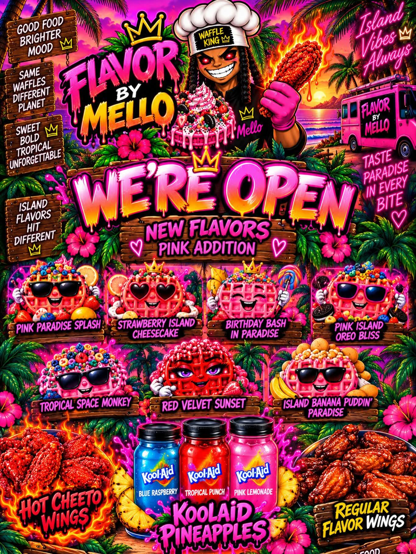
No honestly! Like what is my eye supposed to be focusing on?
A good graphic designer would know how to flow the poster so people will pick up your message at a glance (for most cases, the name of the restaurant and the star dish/cuisine they sell. Other times it may be a promotion like $5 sangria pitcher Sunday).
Then some additional details for people who can look at it longer like other dishes, address, social media handles. Maybe a QR code in the corner.
I see these posters in the wild and I’d pass on reading it. I gotta get my groceries or whatever I’m doing.
14
u/ModifiedLeaf 22d ago
It's always maximalists design lol like where is the negative space? You don't need to pack so much information into a design lol