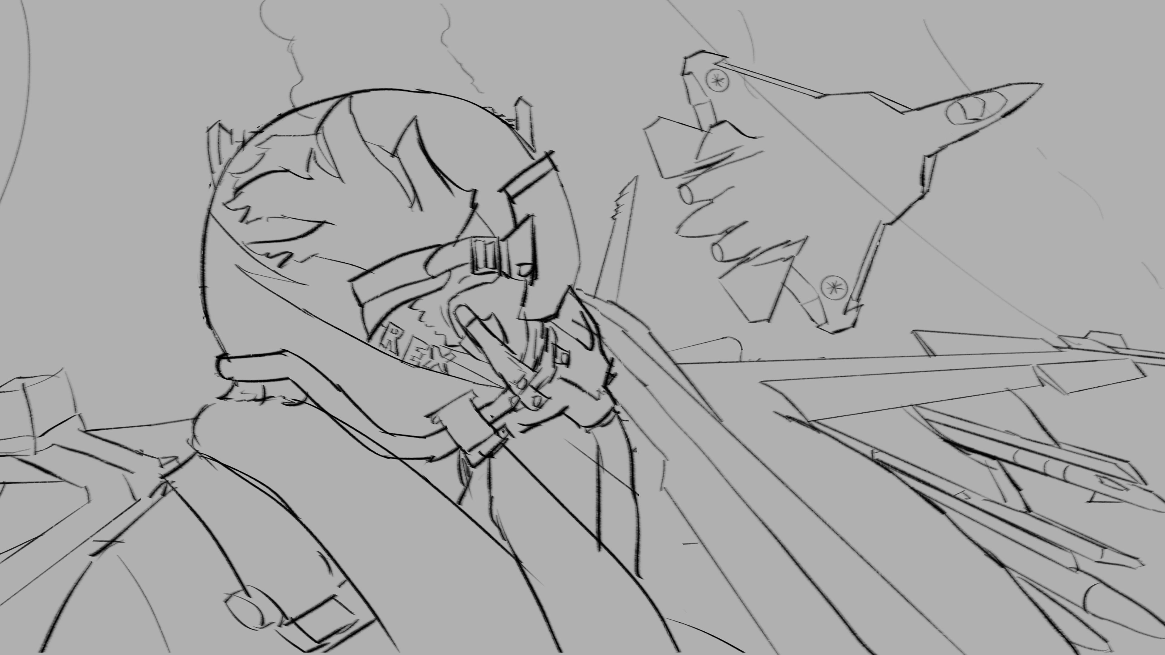
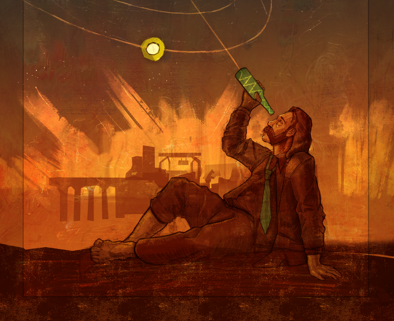
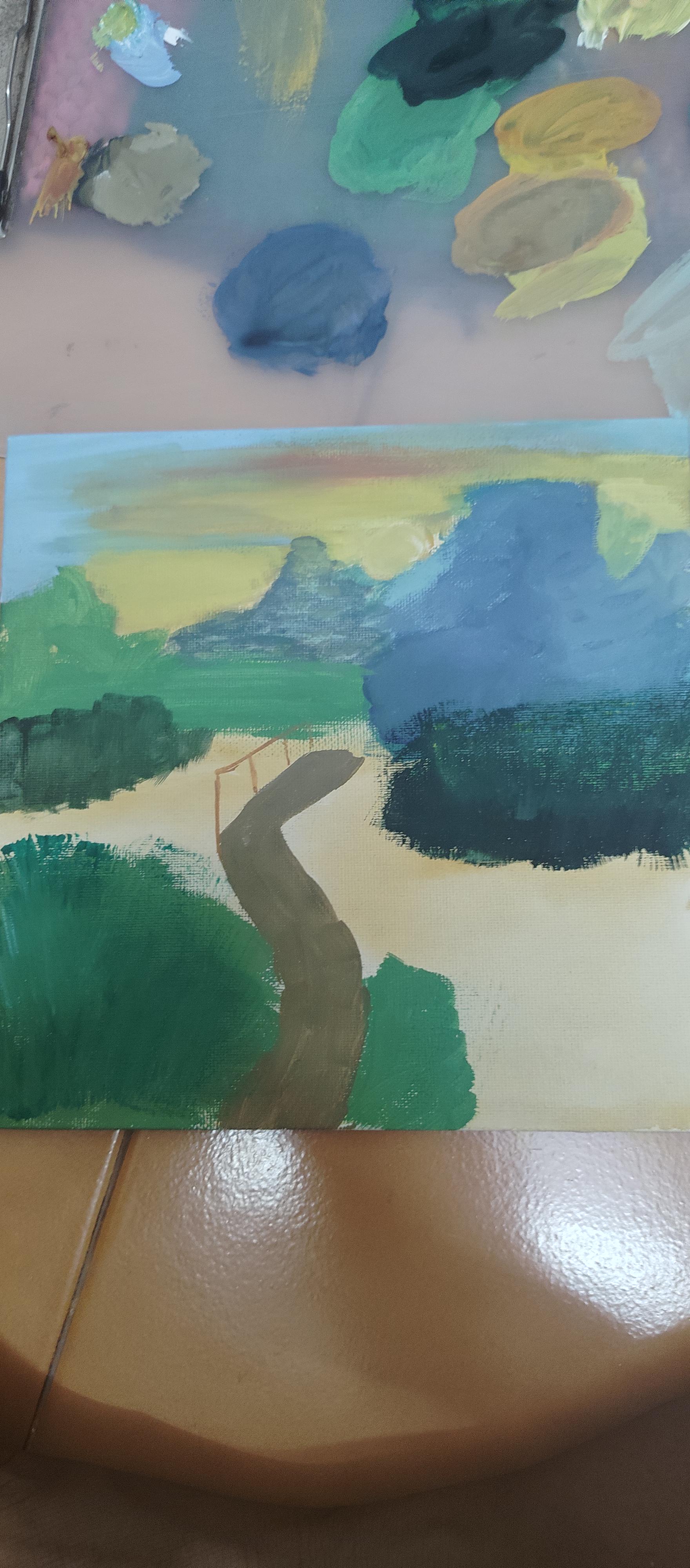
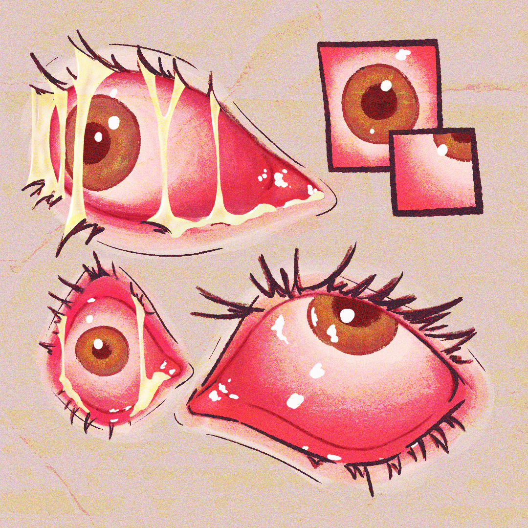
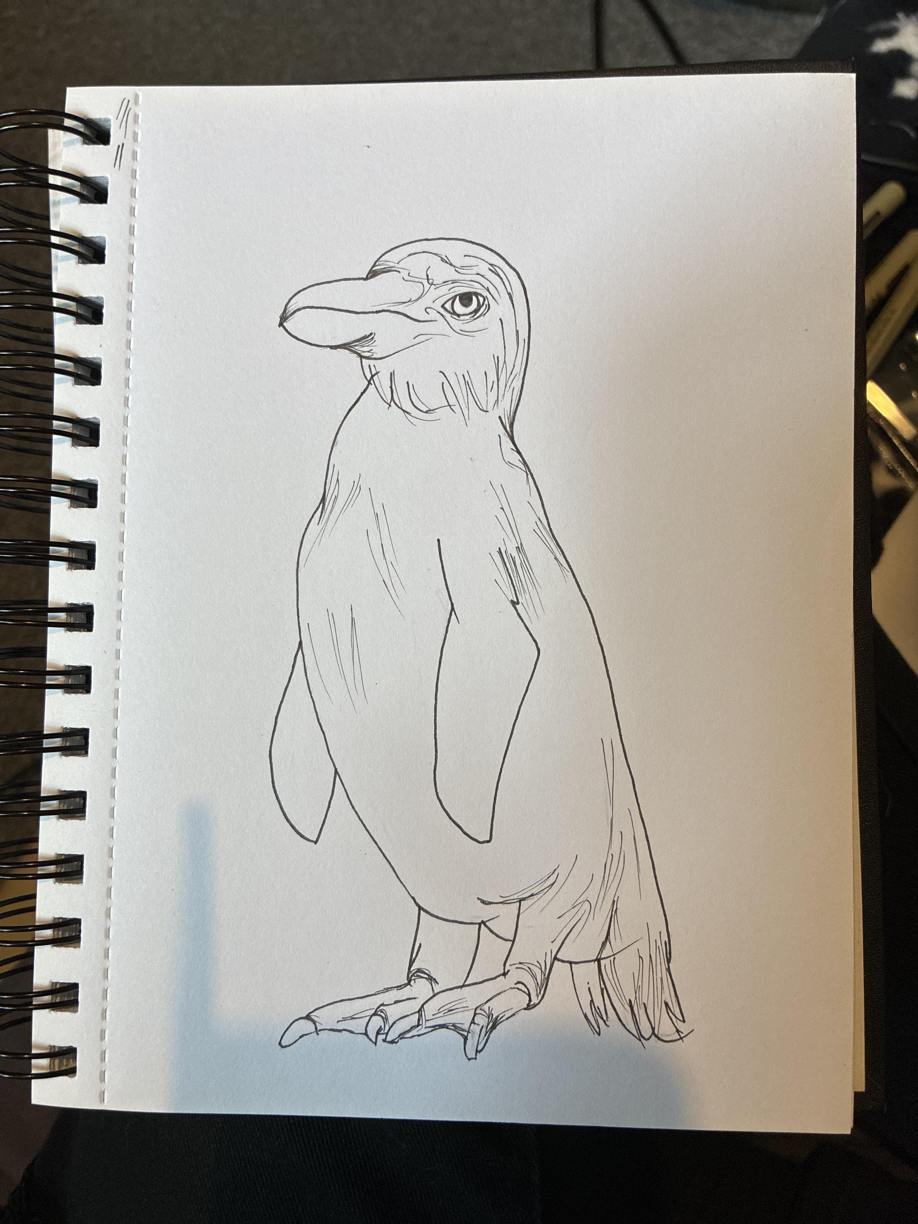
Just the title pretty much, this is about far as I get with most pieces before I'm immediately lost on how to begin coloring and rendering and stuff. It just always feels off or wrong. Do I just need to trust the process more?
Now I'm going very off reference here so I will try and describe what is in my head. I am trying to combine both my references while also greatly exaggerating them, and trying to push the shape forward to give it a lot of depth. Imagine it as having a large sphere under it that it has to push up and over before draping back down and inward toward the middle of the lapel (almost like it could fall in)
I've never drawn fabric for any kind before, so it's been *EXTREMELY* difficult so far I've spent about 50 hours studying and trying to understand and then I end up with this. I am pretty satisfied with my attempt at shading it but this but it is still not in the shape I want it to be. I feel like I've gotten a bit ahead of myself and need to erase everything that falls under that top piece of fabric (Imagining the piece as 2 seperate pieces of fabric, a smaller overlaying piece with the largest pieces closer to what reference 2 is falling underneath it.)
anyone got ideas or recommendations? or maybe a dive into the theory behind making all these circular and s shaped tubes?? This is my first attempt at digital illustration and it's been absolutely grueling and I've learned a lot but fabric and how it flows is so incredibly difficult. it looks more like a sculpture than a piece of fabric to me...
Ignore the text. Anyway, the larger drawing is what I drew from memory. How do the muscles look? Also, is the breast placement correct? Do they look like actual boobs and not balloons? Cus I’m having one of those days where this stuff is becoming frustrating and I just don’t feel like looking for mistakes.
I think I just need fresh eyes. Ive tried to draw this many times but there is just something im not understanding about proportions not even with studying with art books
I’m really struggling with making this grass look realistic, I feel like it looks so flat. I’m not done with the painting as a whole, but this part is really frustrating me. Any advice is appreciated! I used a couple reference pictures but I included the one I’m using for the grass here.
Had to delete a previous post I made cus I forgot to add the image 😭
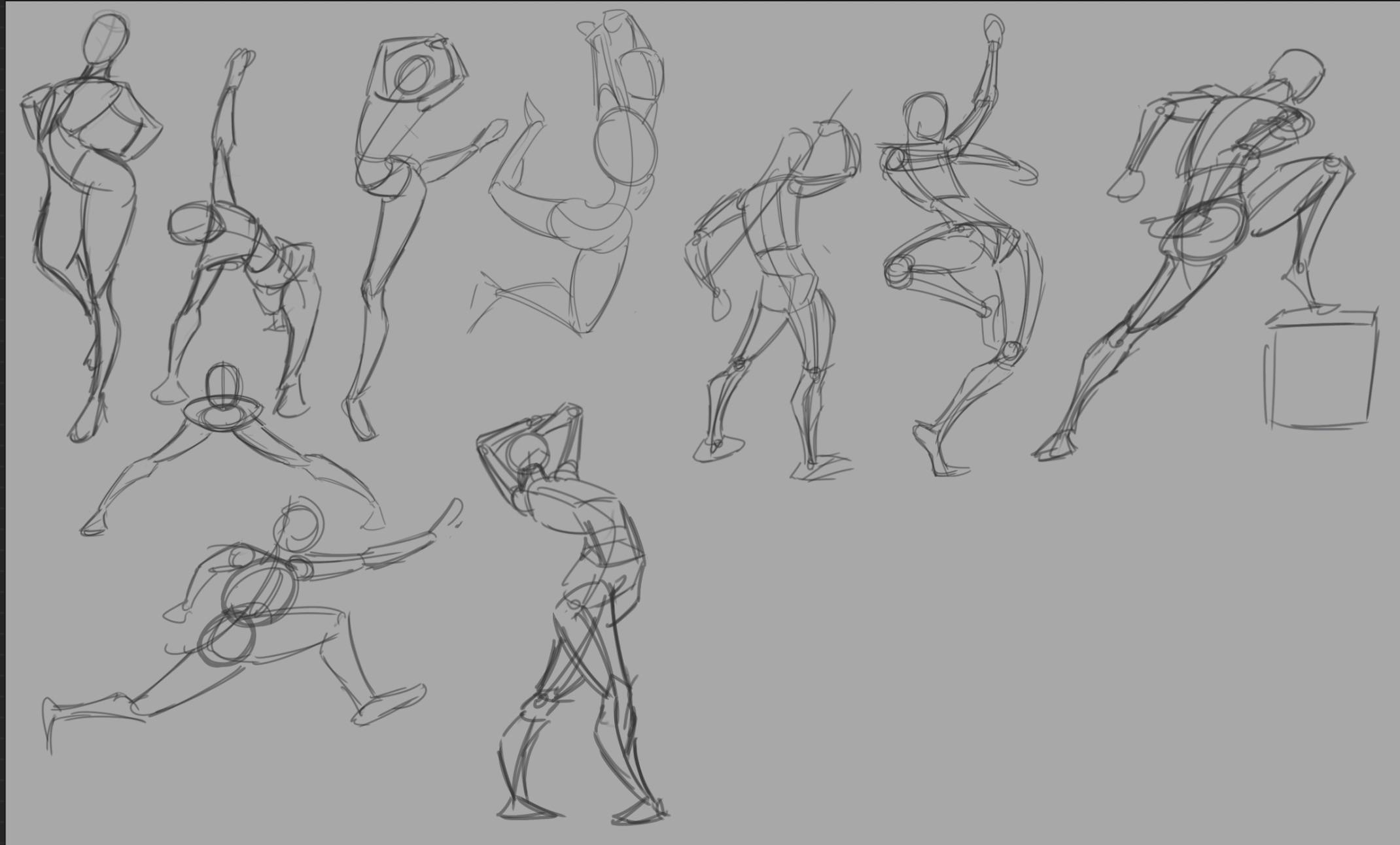
How do these look? Am I doing gestures right? I try to get into gestures but I always end up quitting whenever I see other people do it. Also, how is this supposed to help? I feel it’ll reinforce mistakes since apparently you’re not supposed to worry about mistakes when doing gestures.
Started to give landscaping a try since I love painting backgrounds and it's going.. okay? The values are off and the cliff feels flat, and honestly I have zero clue how to render a cliffside, it needs to feel "rocky" and that (in my current knowledge) requires details, but alot of details make it feel kinda muddy and hard to read, so i'm kinda lost lol.
So some tips would be appreciated, and also, is starting landscapes in greyscale a good idea? Or should I just do greyscale for thumbnails to find a good composition? Thanks in advance :)
side by side to show how different my piece is compared to the reference.
I struggle to find the "right" colors to depict things especially lighter colors or greys without using just a straight up gray color.
Additionally I struggle with lighting and shadows a lot, as you can see, the rocky shore was supposed to be much brighter but I can't seem to replicate the lighting with watercolors. I also tried using complementary colors for shadows instead of just blacks (as seen in the lighthouse, the shadows are blue) and that definitely did help but not as much as I wanted it to be.
How can I better learn to pick and choose my colors and use them effectively?
Hi, something seems off about the man. I can't say exactly what I'm not great with anatomy, and I'm drawing this pose from memory while using separate references for different body parts, which makes everything look a bit "disconnected."
I’m currently practicing anatomy and body construction. I’m focusing mainly on the forms, muscle connections and proportions. I’m not adding detailed hands/fingers yet because I’m planning to study those separately.
I’d appreciate feedback, especially on the proportions, anatomy and connections.
Hey! I'm working on this, if you have any feedback in color, composition, drawing or anything is more than welcome! I would like to keep improving it but I need some opinions, thanks!!!
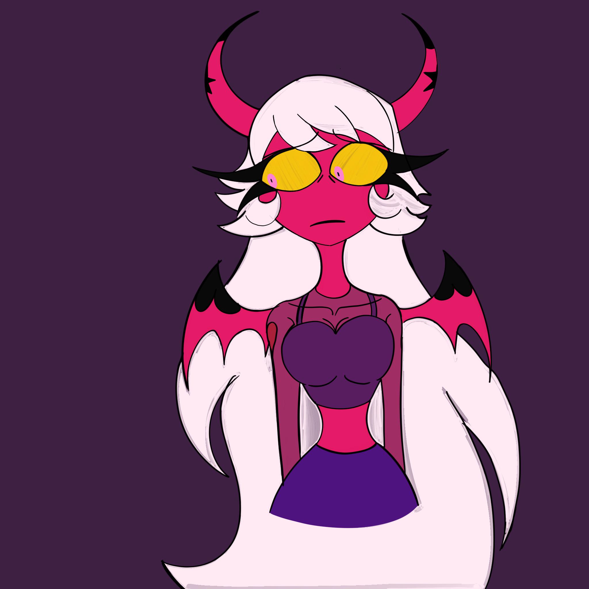
I’m a beginner digital artist and I’m looking to improve ! If you have an critiques or advice please let me know :)
(Made on procreate)
PS: for context, this is my D&D character.
I know that these pages are rough drawings - but I'm mostly looking for critiques on the actual structuring of each page. I've just been drawing at least one page a day to just get it out, so I haven't had much time to stop and think too much about what I could do a lot better!
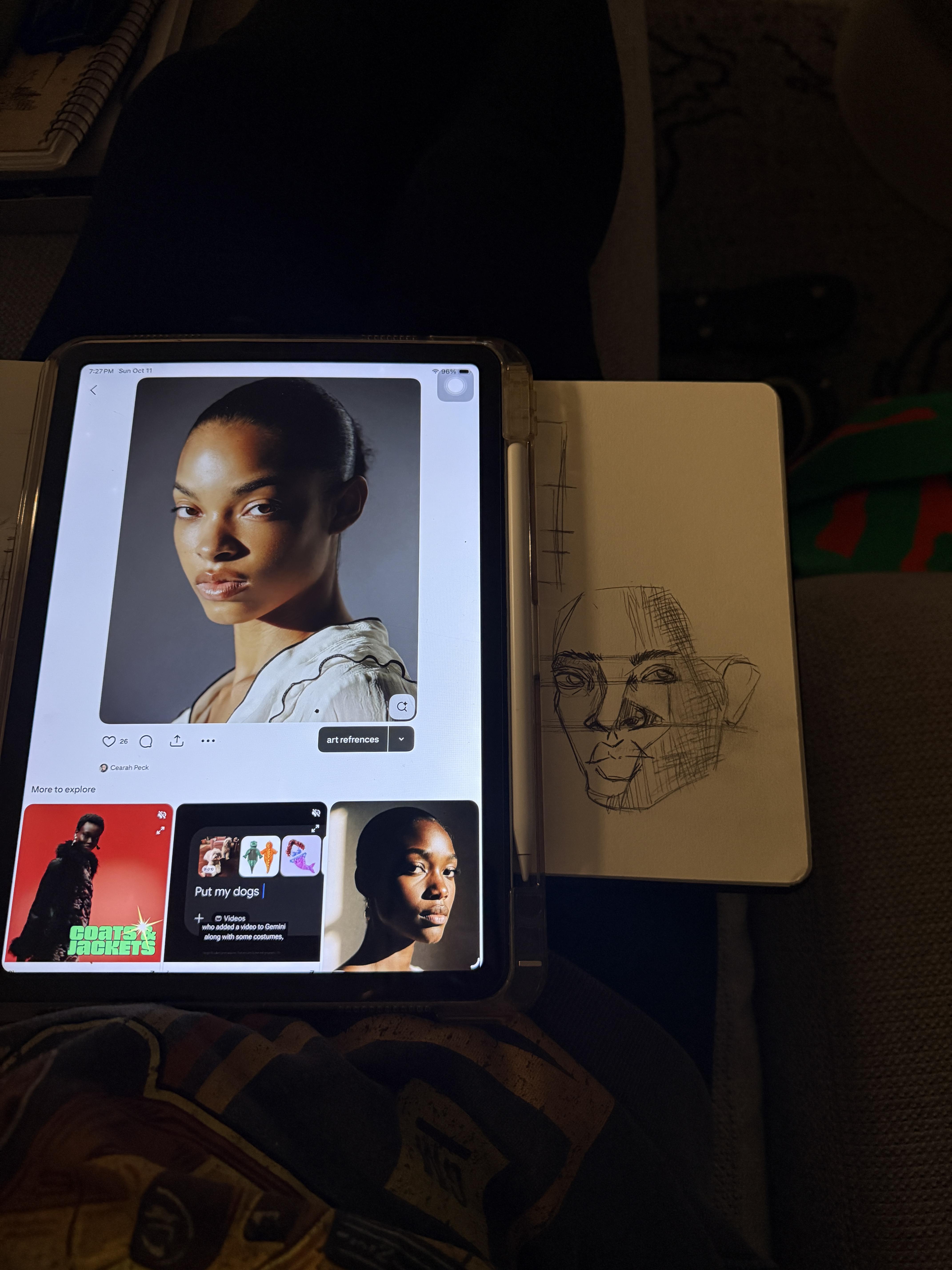
Hey so I was wondering if I could get some feedback on head construction. I only started learning how to draw beginning of September and been doing head construction for 2 maybe 3 weeks. My main place of learning so far has been the head drawing basics construction course on skillshare.
I wanted to get a bit of feedback from an actual person to see how I'm doing and specific ways I can improve. I've asked Chatgpt to feedback as I've not known where to get any from, but as expected the feedback from chatgpt isnt the greatest